

Why reviewing multilingual slides is non-negotiable
Automated translation gets you a first draft. It does not get you a presentation that works. The real risk in multilingual slides is not a wrong word; it is a broken layout, a culturally tone-deaf visual, or a call-to-action that loses all its force in the target language. Human review is the step that catches what machines cannot.
Here is what a proper review actually protects against:
- Layout-sensitive localisation errors that automated tools miss entirely, including text overflow, clipped lines, and broken visual hierarchies in charts and tables
- Right-to-left formatting failures in Arabic, Hebrew, and Farsi, where the entire slide structure needs rethinking, not just the words
- Culturally inappropriate content, from colour associations to imagery that reads differently across markets
- Brand voice drift, where a confident headline becomes a flat, literal sentence that no longer persuades
- Corrupted messaging on high-stakes slides, particularly pricing, legal claims, and investor-facing content where wording precision is everything
The benefits of multilingual slides are real: broader reach, stronger cultural relationships, and clearer communication with diverse audiences. But those benefits only materialise when the slides have been properly reviewed.
What goes wrong in multilingual slide presentations
The most common problems in multilingual presentations are structural, not linguistic. Text expansion is the biggest culprit: languages like German and Polish routinely need more characters to express the same idea, pushing text out of fixed-width containers and breaking layouts that were designed to the pixel.
- Text overflow and clipping from expansion in Germanic and Slavic languages, where translated strings wrap unpredictably inside tight title boxes and table headers
- RTL layout failures requiring full structural adaptation, not just text direction changes
- Font and character width differences that shift spacing, particularly with Cyrillic, CJK, and Arabic scripts
- Hidden untranslated elements: speaker notes and embedded chart labels are frequently overlooked, leaving inconsistencies that undermine credibility during live delivery
- Cultural sensitivity gaps that pure translation misses, including imagery, colour symbolism, and idiomatic expressions that carry unintended meaning in the target culture
- Manual line breaks that look fine in English and become harmful after translation, forcing awkward mid-phrase splits
Pro Tip: Prioritise slides with the densest content first: the slide with the biggest table, the most bullets, and the smallest footnote text. Fixing those three usually removes the majority of layout issues across the entire deck.

How to balance technology and human review
Automated translation tools speed up the process considerably, but they cannot fix layout breakages reliably. Most post-translation rework cost comes from fixed-dimension containers and character expansion in PPTX files, not from translation inaccuracy itself. That is a structural problem, and no translation engine resolves it automatically.
- Use PPTX-aware tools that adapt text boxes to fit the target language and keep slide structure stable, reducing the amount of manual redesign required
- Plan a human QA pass regardless of how good the automated output looks; automation struggles with brand voice consistency, manual line breaks, and embedded image text
- Animations usually survive translation when slide structure stays intact, but dense slides with custom animation sequences always need a dedicated QA check
- Reserve human review for high-stakes content: pricing, legal claims, marketing calls-to-action, and investor-facing decks where wording precision directly affects trust and conversion
- Avoid treating automation as the final step; use it to generate a working draft, then apply human judgement to the slides that carry the most persuasive weight
For a deeper look at where automated translation falls short in business contexts, the AI translation guide covers the specific gaps that require human correction.
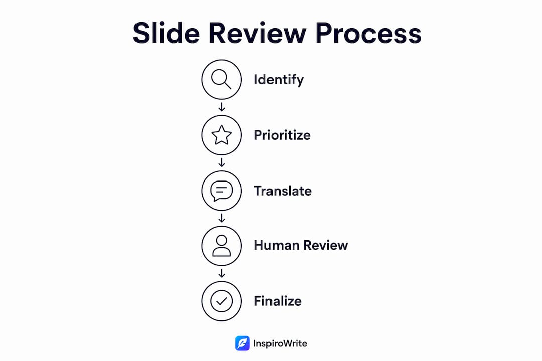
Best practices for reviewing multilingual slides
The most effective review process is time-boxed and risk-first. A focused brief peer review targeting structure, clarity, brand consistency, and data accuracy catches the majority of typical errors without derailing project timelines.
- Review high-impact slides first: title, problem, solution, proof, and CTA slides carry most of the persuasive load; approve these before scanning the rest for layout issues
- Use glossaries and translation memories to lock brand terms, feature names, and approved phrasing, preventing terminology drift across slides and language versions
- Design language-friendly templates from the outset: avoid ultra-tight titles and tables in the source deck, especially when you know localisation is planned
- Engage native-language reviewers for cultural validation, not just linguistic accuracy; a fluent speaker who understands the target market will catch connotation problems a bilingual proofreader might miss
- Check hidden elements deliberately: speaker notes, embedded chart text, and footnotes need the same review rigour as body copy
- Maintain one source-of-truth deck and avoid editing different language versions independently, which causes structural drift over time
For a structured approach to this process, the cross-language proofreading checklist provides a practical framework you can apply immediately.
Pro Tip: Avoid placing two languages in a single text block on the same slide. Research on multilingual slide layouts shows that mixed-layout slides are judged as more crowded and require more processing effort than separated-block layouts, increasing cognitive load for your audience.
What presentation strategists and localisation experts say
The consensus among presentation professionals is clear: audience-centred design is the foundation of any effective multilingual slide. Melissa Marshall, whose work on technical presentations is endorsed by Harvard Catalyst, argues that overloading slides with text increases the risk of cognitive overload, and that shifting focus from the speaker to the audience produces measurably stronger presentations.
Presentation strategists at SlideBazaar endorse a brief peer review as a structured quality checkpoint that catches most presentation errors before they reach an audience. The time constraint is deliberate: it forces reviewers to focus on high-impact issues rather than minor stylistic preferences.
Localisation experts add a further layer: reviewing hidden slide elements such as speaker notes and embedded chart labels is frequently overlooked but directly affects professionalism. A slide that looks polished on screen can still undermine credibility the moment a presenter reads from untranslated notes.
What happens when you skip the review
Skipping the review does not just risk embarrassment. The consequences range from minor credibility damage to serious commercial and legal exposure.
A literal translation that weakens a headline or flattens a CTA quietly reduces audience confidence, even when the meaning is technically correct. Pricing slides with mistranslated units, discounts, or terms create contractual ambiguity. Legal or compliance content that has been translated without human validation can expose an organisation to regulatory risk. In investor-facing decks, a single slide that reads as poorly localised can undermine the entire narrative.
Layout failures carry their own costs. When text overflows or clips on a title slide, the audience's first impression is one of carelessness. A broken table on a proof slide makes data look unreliable. These are not hypothetical risks; they are the predictable result of skipping a QA pass on a translated deck.
Real-world examples of review failures and successes
The pattern of failure is consistent across industries. A sales deck translated for a German-speaking market without layout review arrives with overflowing title boxes and clipped bullet points, because German text typically requires more space than English. The presenter either rushes through the broken slides or stops to apologise, both of which damage credibility.
A more instructive example comes from marketing localisation. A pitch deck translated literally for a new market retained accurate meaning but lost persuasive force: the headline became verbose, the CTA verb felt unnatural, and the proof slide read like a dictionary rather than a confident claim. The deck was technically correct and commercially ineffective.
The success cases share a common structure: a risk-first review pass targeting the densest and highest-stakes slides, native-language validation for cultural fit, and glossary-controlled terminology to prevent drift. Organisations that build this into their workflow as a non-negotiable step before distribution consistently avoid the rework costs that come from post-delivery corrections. For teams managing cross-language collaboration, building review into the production process rather than treating it as an afterthought is the single biggest efficiency gain.
How to build an effective multilingual slide review team
A review team for multilingual presentations needs three distinct roles, and conflating them is where most organisations go wrong.

The linguistic reviewer is a native speaker of the target language with subject-matter familiarity. Their job is accuracy and naturalness: does this read the way the target market actually speaks, or does it sound translated? They are not a designer and should not be asked to fix layout issues.
The cultural validator goes beyond language to assess imagery, colour choices, idiomatic expressions, and cultural references. This role is particularly important for markets where visual symbolism carries strong associations. Not every linguistic reviewer has this expertise; in high-stakes markets, it warrants a separate pass.
The layout and brand reviewer checks that the translated deck adheres to visual standards: fonts, colours, logo usage, spacing, and the structural integrity of tables and charts. This person does not need to speak the target language fluently, but they do need to know what a well-formatted slide looks like and where expansion typically causes problems.
For terminology consistency across the deck, the team should work from a shared glossary approved before translation begins. Reviewers who discover terminology drift mid-review should flag it centrally rather than making independent corrections, which creates new inconsistencies.
Key takeaways
Multilingual slides require human review because automated translation cannot resolve layout breakage, cultural nuance, or brand voice consistency on its own.
| Point | Details |
|---|---|
| Layout errors dominate rework costs | Text expansion in fixed containers causes most post-translation repairs, not translation inaccuracy. |
| Risk-first review saves time | Prioritise the slide with the biggest table, most bullets, and smallest text to remove the majority of issues efficiently. |
| 10-minute peer review catches 95% of errors | A time-boxed review targeting structure, clarity, brand consistency, and data accuracy is endorsed by presentation strategists. |
| Hidden elements need deliberate checking | Speaker notes and embedded chart labels are frequently untranslated and undermine professionalism during live delivery. |
| Three-role review teams work best | Separate linguistic, cultural, and layout review responsibilities to avoid gaps and conflation of expertise. |
FAQ
Why do multilingual slides need a human review pass?
Automated translation cannot fix layout breakage, cultural nuance, or brand voice. Human reviewers catch text overflow, RTL formatting failures, and mistranslated calls-to-action that machines consistently miss.
What is the most efficient way to review a translated presentation?
A time-boxed 10-minute peer review focusing on structure, clarity, brand consistency, and data accuracy catches 95% of typical errors. Start with the densest slides: the biggest table, the most bullets, and the smallest footnote text.
Why is a multilingual approach important for presentations?
Presenting in your audience's language builds trust, improves comprehension, and demonstrates cultural awareness. Bilingual and multilingual presentations reach broader audiences and reduce miscommunication, particularly for complex or technical content.
What are the main challenges in multilingual slide design?
Text expansion causing overflow, RTL formatting requirements, font compatibility issues, untranslated hidden elements such as speaker notes, and cultural sensitivity gaps in imagery and colour choice are the most common obstacles.
How does layout affect multilingual slide comprehension?
Research on multilingual educational slides shows that mixed-layout slides, where languages alternate line by line, are judged as more crowded and require more processing effort than separated-block layouts. Keeping languages in distinct visual blocks reduces cognitive load for your audience.